Two Apps I Recently Paid For That I Like
Actually paying for apps is a weird phenomenon. It's funny how we can make impulse buys on a lot of things, but when it comes to dropping a dollar (or even three) on an app, we put on the brakes really quickly. At least I know that I do.
This cartoon from The Oatmeal perfectly sums up how I compare purchasing a mobile app with purchasing...well...anything else.
Recently, I've downloaded two different apps that I've grown to love. At least so far. They weren't totally free but they weren't totally expensive either.
Todoist: My New Task Manager
Todoist has a freemium model. To give it a test drive, you don't have to pay a dime. There are a lot of features that you can use that are absolutely free. For a lot of people, those features are sufficient. That's how I started out. I tend to hop from task manager to task manager (e.g., Wunderlist, Any.do, Evernote reminders, etc.) so I wanted to spend some time in the free version of Todoist to see if it was something I'd actually commit to for more than a month.
I did. And now that I've signed on for a year membership, I'm locked in for a while.
I really dig Todoist. It is incredibly feature heavy (you can do almost anything with it) but it's amazing. I love the timed out push notifications on my phone, the natural language processing of scheduling tasks (i.e., instead of inputting a specific date range, I can just type "the day after tomorrow" and it knows how to schedule), and the fact that I can attach files and/or voice recordings to my tasks. I also love the flagging feature and how it allows me to rearrange all of my tasks in order of priority to start out each day. I actually spend very little time in Todoist, which I find ideal.
It also integrates with just about anything. The iPhone app is wonderful. I can input tasks into my calendar for the day. It has a great desktop app for Mac. There are a lot of features included in it that I'm probably not even utilizing at the moment.
There has only been one real letdown for me: Outlook integration for Mac. The icing on the cake for me getting a year subscription to their service was the Outlook integration. The fact that I could integrate my to-do list with my desktop email client sounded amazing. The videos I saw on how to do it looked extremely useful. However, after I downloaded the app, I realized that the Outlook integration had not come to Mac computers. It is currently only available to PCs.
However, I have somewhat of a sunk cost bias, so it's still my to-do list app of choice at the moment (and still recommend it to others).
Timepage: Moleskin's New Calendar App
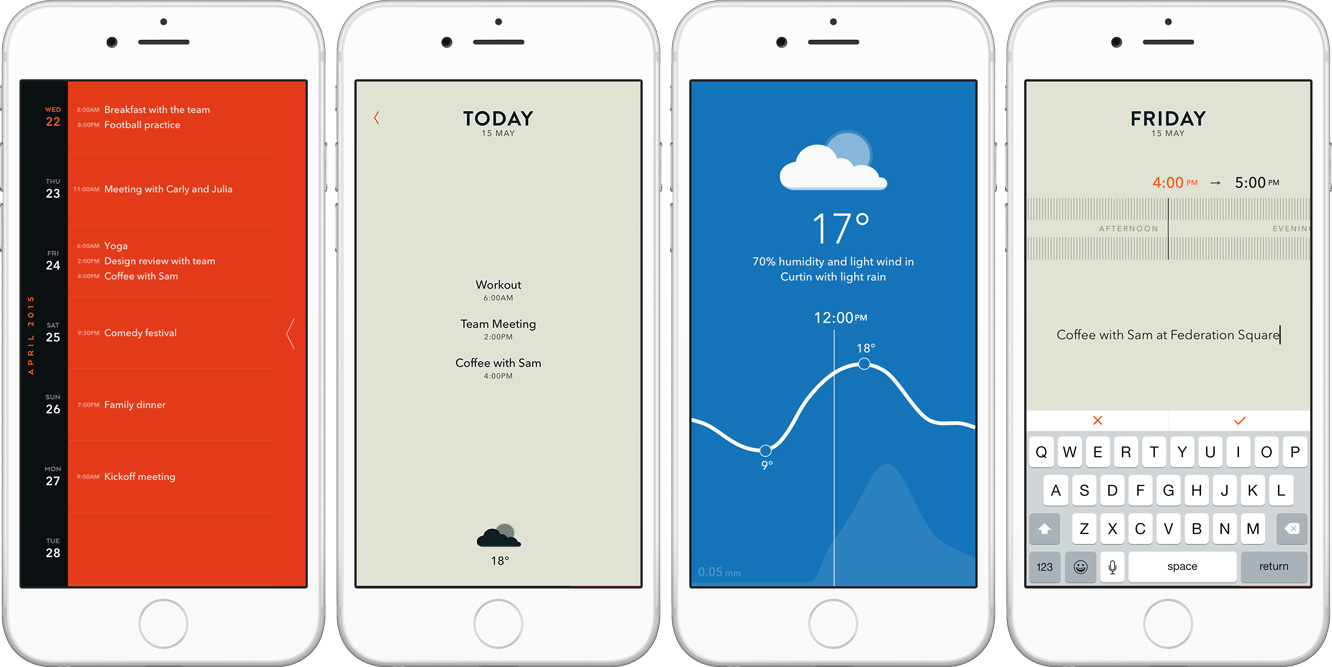
It's cool when a company who is known for making physical paper products comes out with a cool piece of technology. Last week, Moleskin released a new calendar app called Timepage, and the design is incredible.
Unlike a lot of cool new calendar apps, this one synced up with my Exchange calendar right away (where most of my meetings live). The user experience is really intuitive and the app itself is gorgeous...and useful! Not only can you do normal calendar-y things (schedule meetings, see what is next, set reminders) but you have a cool interactive weather forecast feature along with directions to your next meeting (and the directions don't default to Apple Maps!).
If design is something you value in an app, I think Timepage is worth the equivalent-of-one-cup-of-coffee that you would pay for it. I haven't had any issues with it so far.
Between Timepage and Todoist, organizing my day has become a lot easier and received a significant aesthetic upgrade.
What about you? Do you use any of these two apps? What are your go-to calendar and task management apps?

